
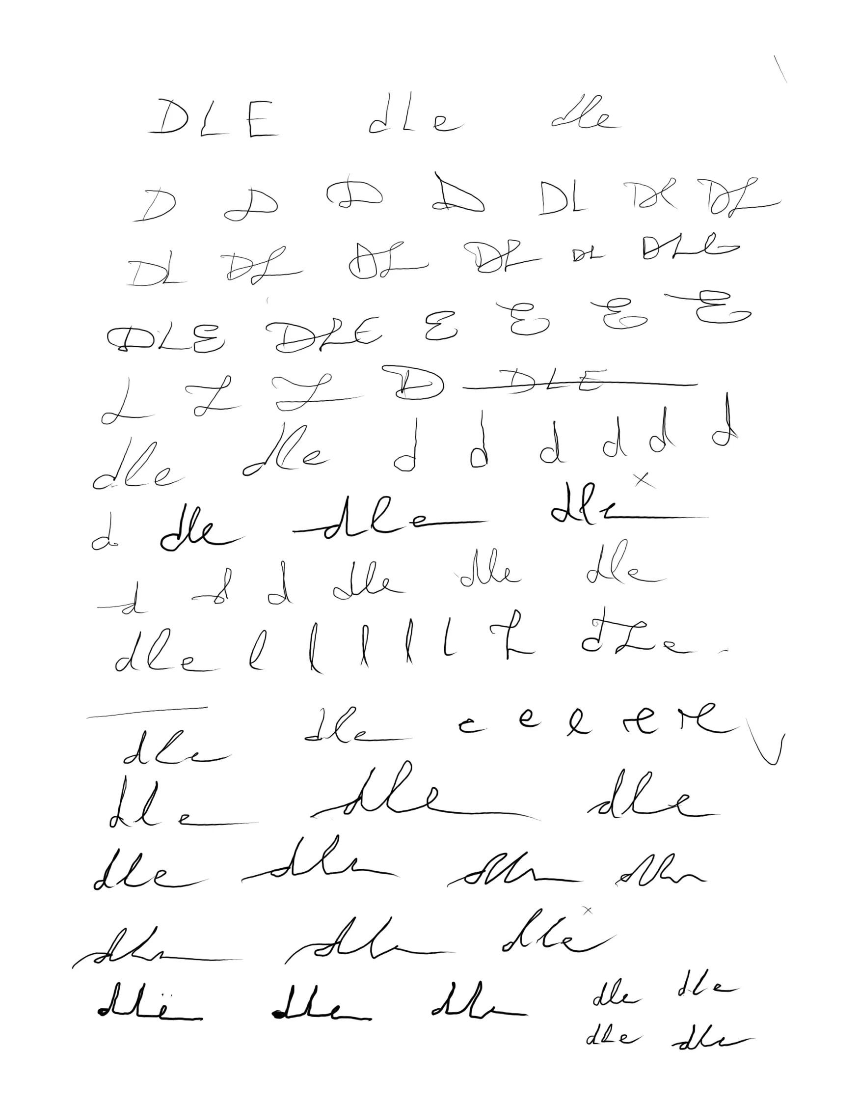
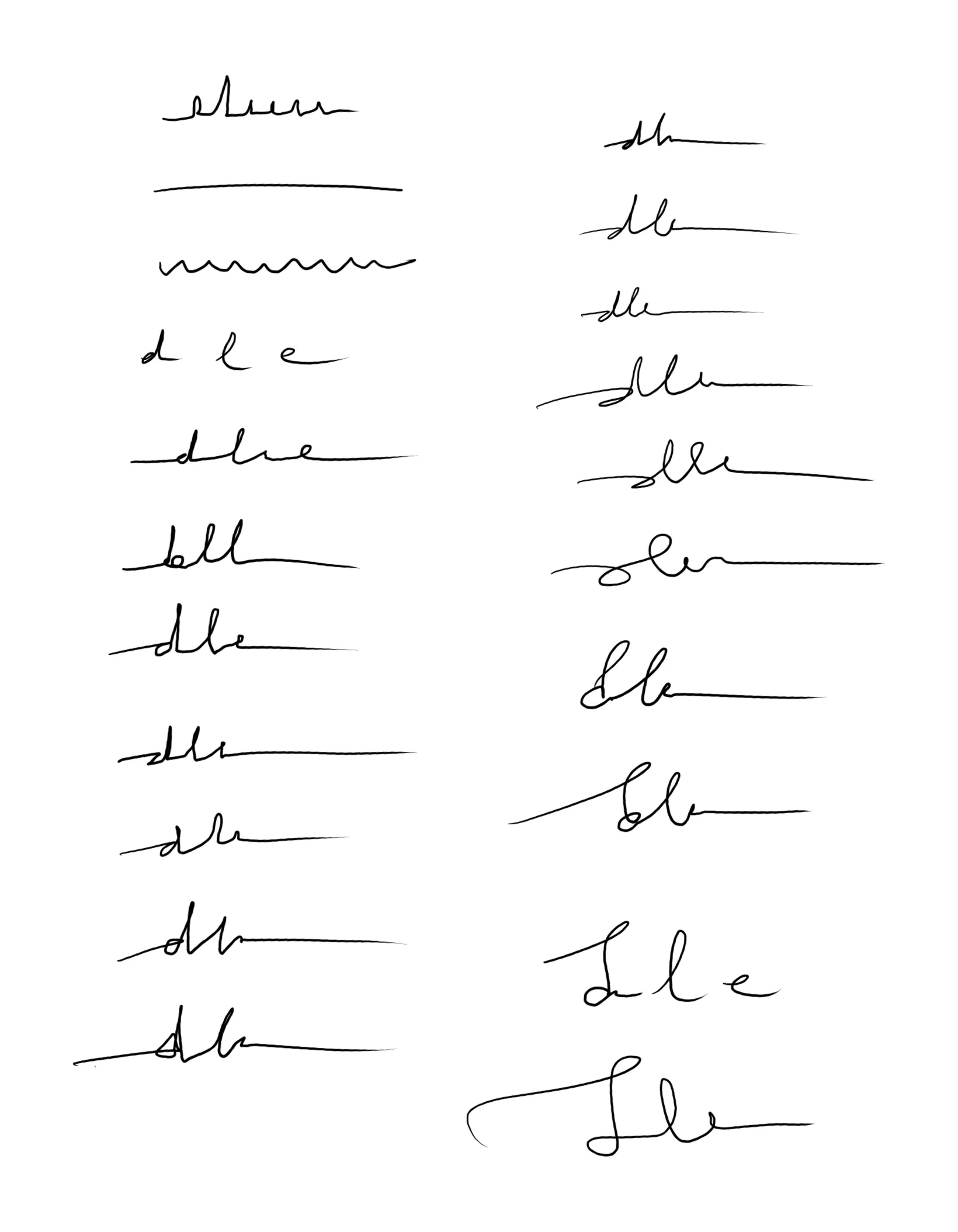
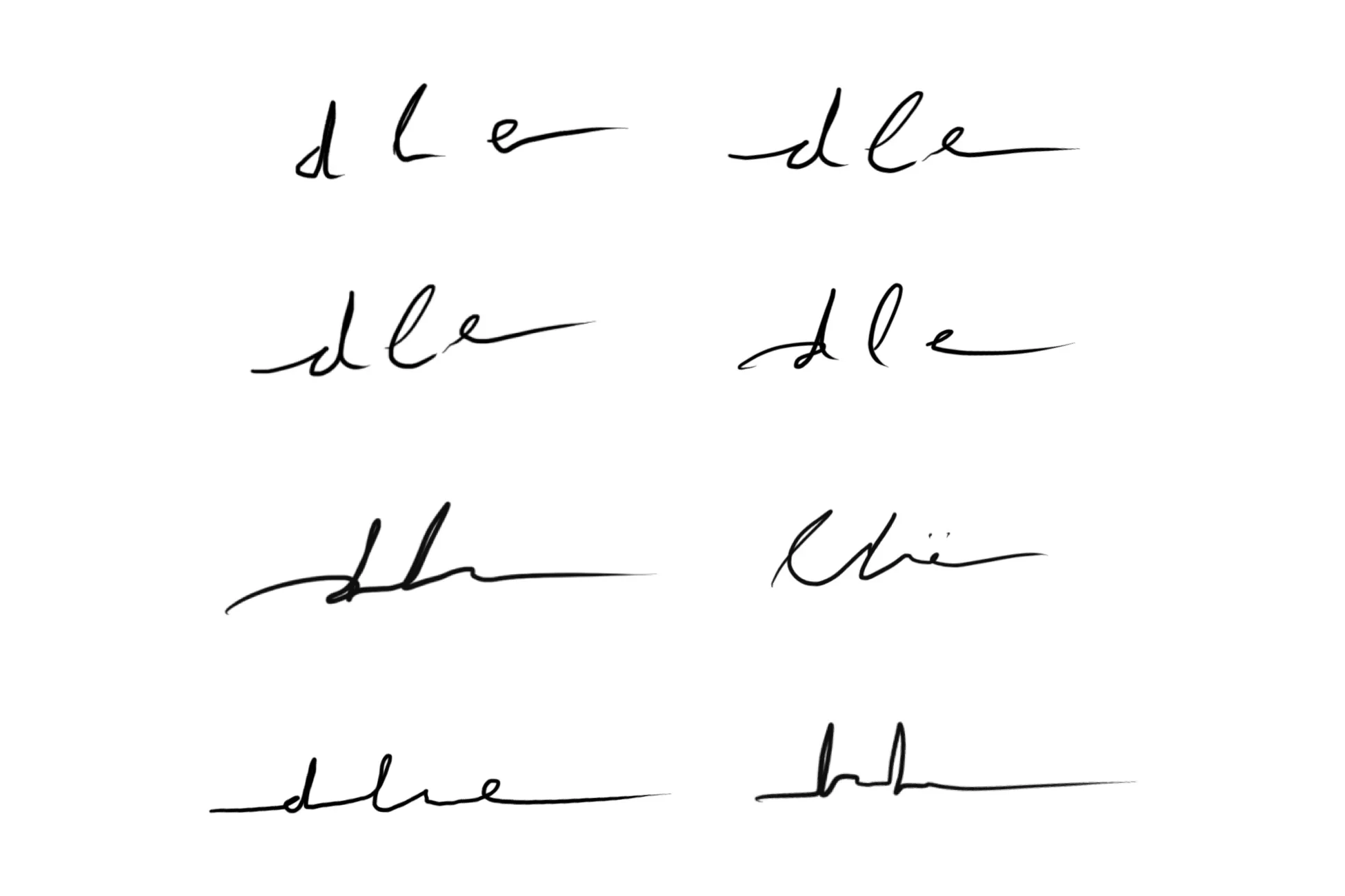
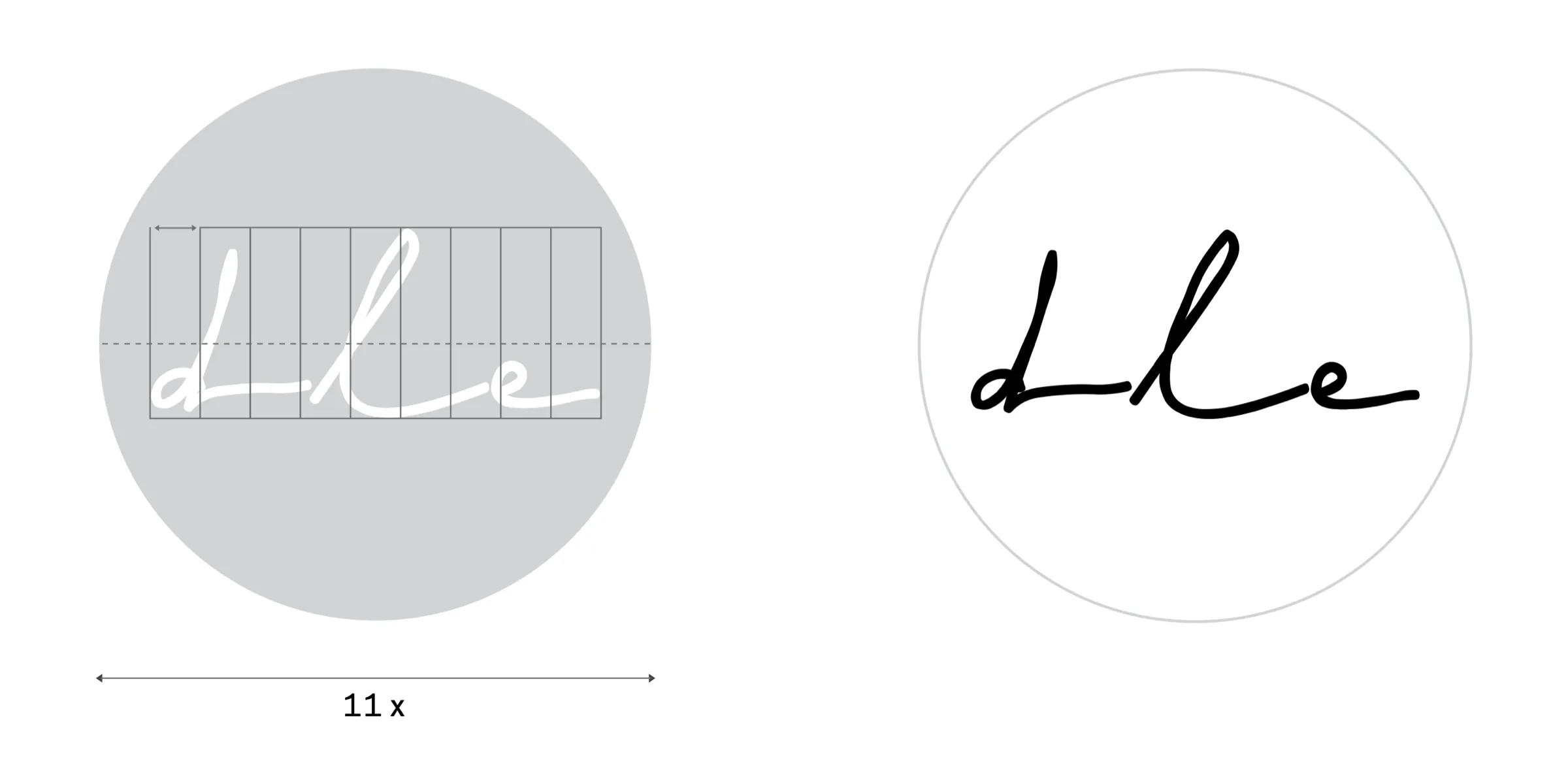
One new thing: a mark of its own, for places too small for the name. dle, written by hand over and over, weighing legibility against authority, until one felt right. Then traced.
← After work
Designlab Experience
They asked for a refinement, not a new logo. Together we worked out what to keep, what to change, and why. Our aim was to ready their logo for the years ahead: firmer letters, black and white, and a small handwritten mark, dle.
- Year
- 2021
- Kind
- Identity
- With
- —
- Scope
- Logo refinement, wording, social, website, brand guidelines
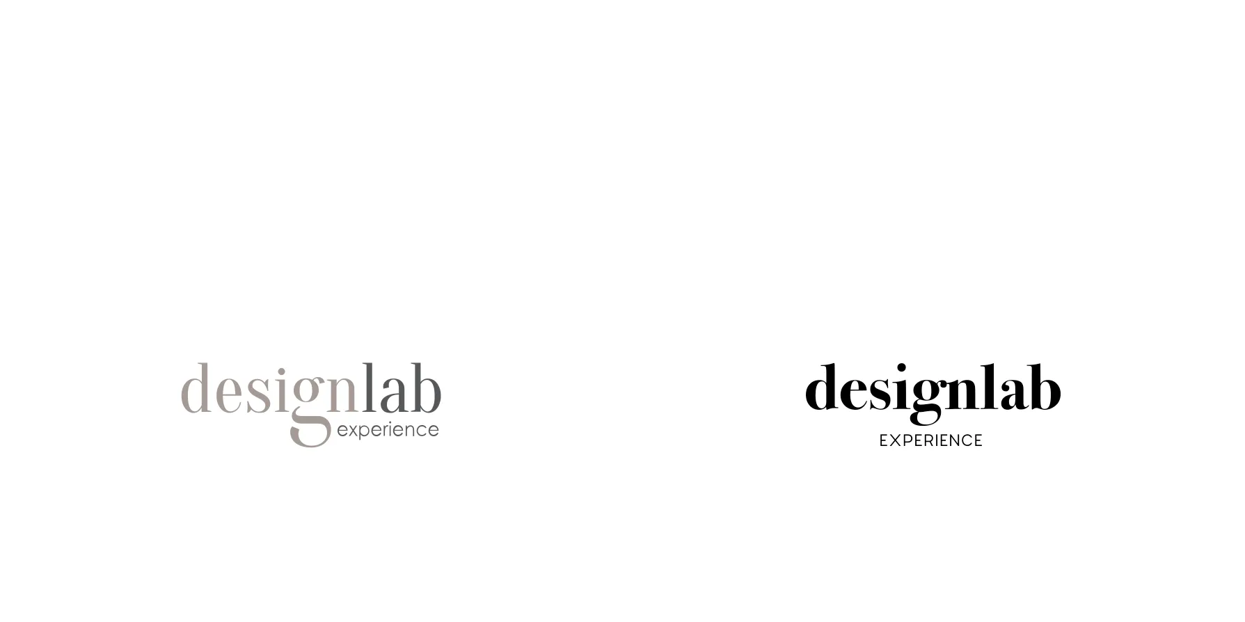
BeforeAfter
By hand
Three shapes
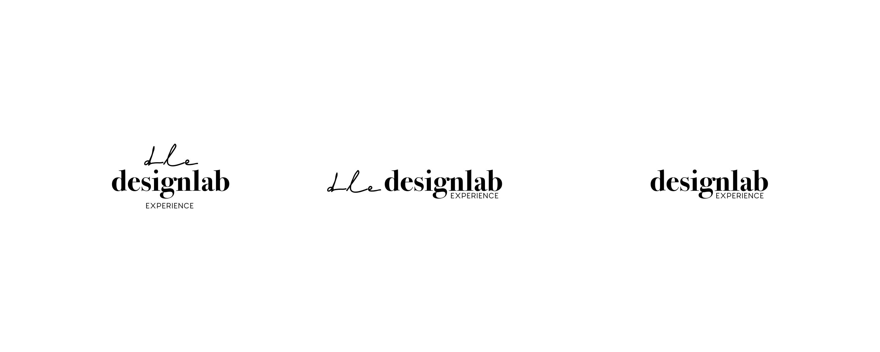
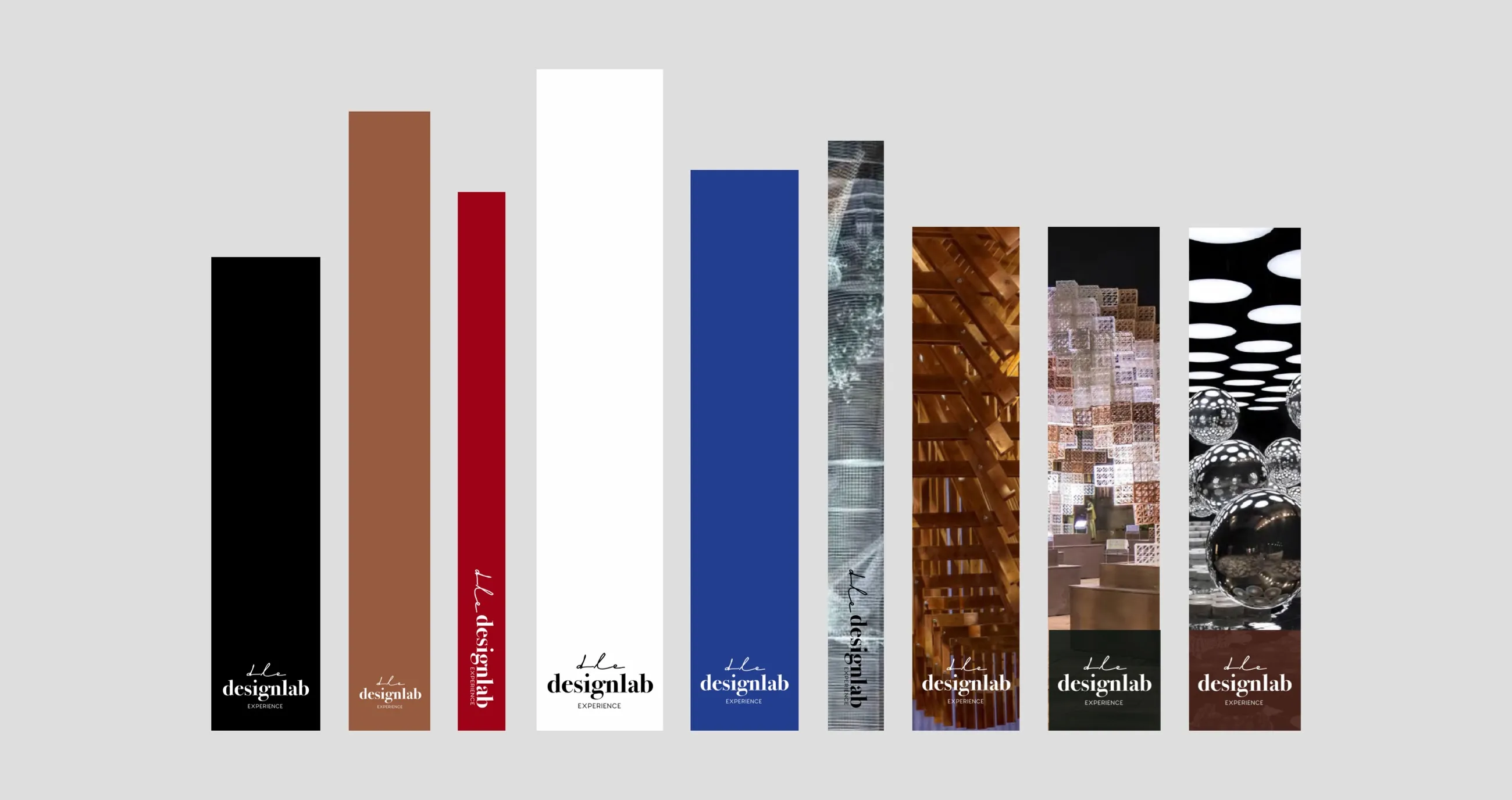
Stacked where the space is square, in one line where it is wide, the name alone where it is tight. On black, white, colour or a photograph. And just dle, as an avatar.
Online
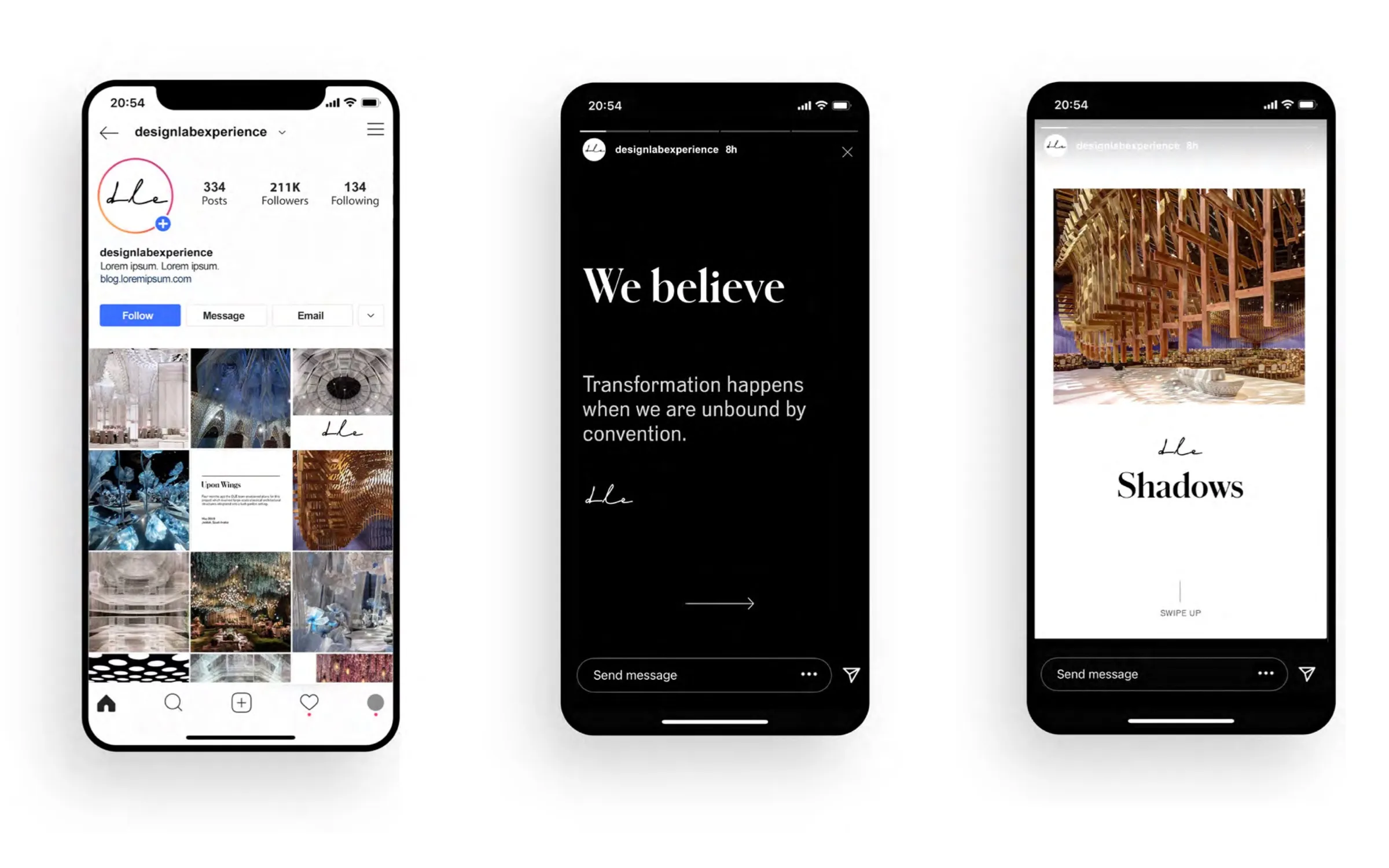
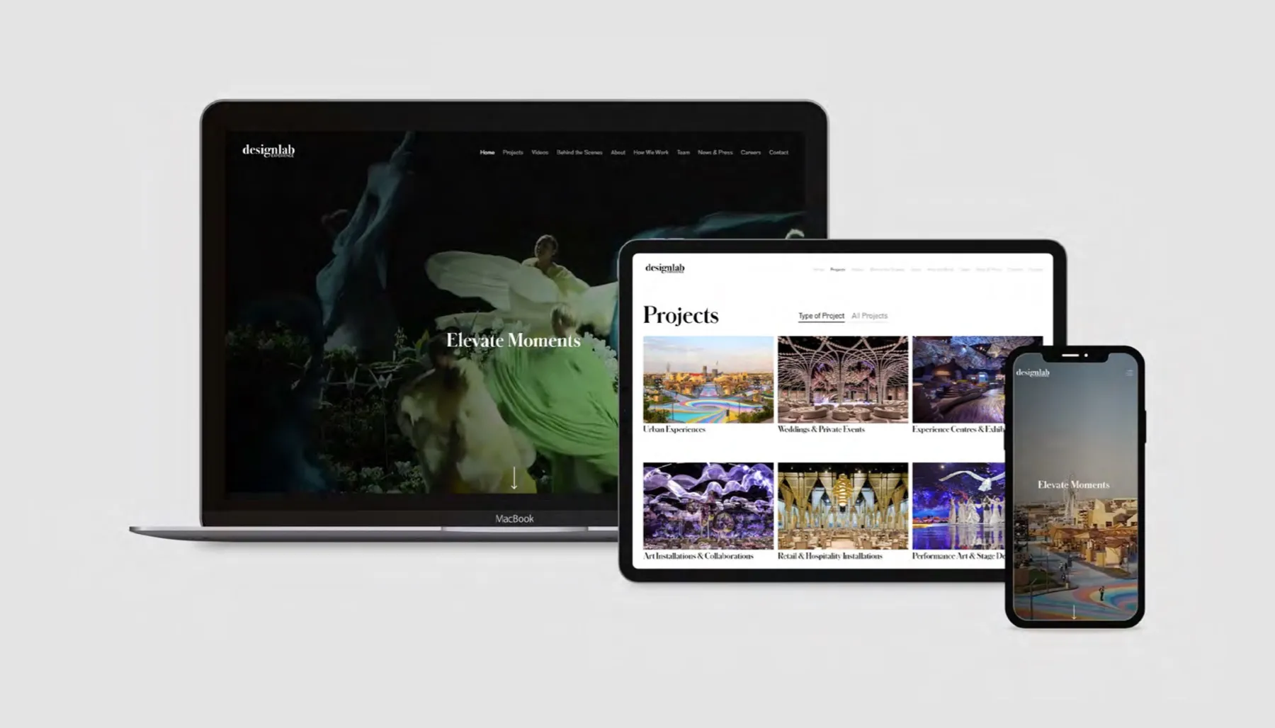
We rewrote their words and shaped how they would show up on social and other channels, so people would see them the way they saw themselves. A new website rounds it all off.
On paper
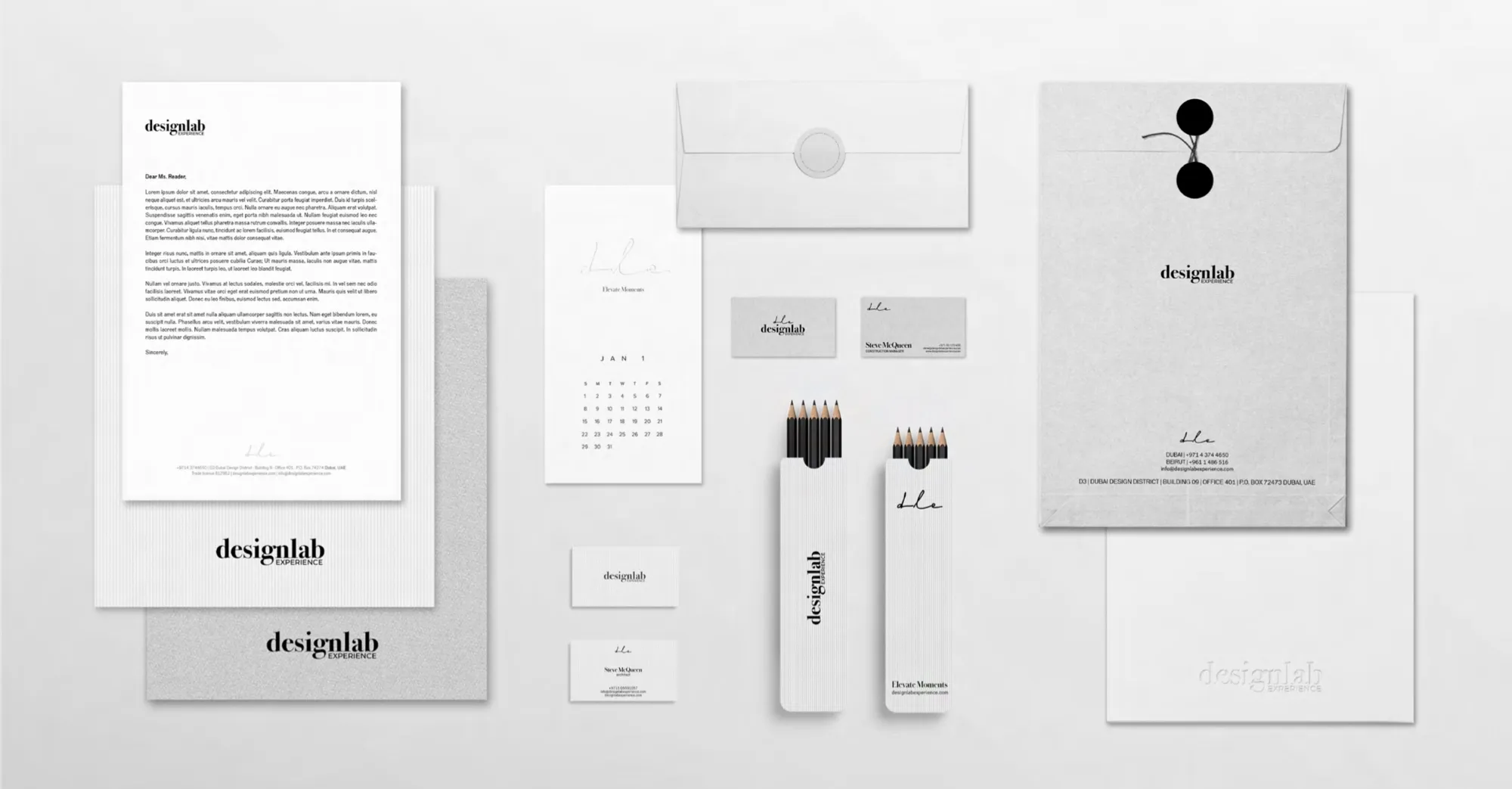
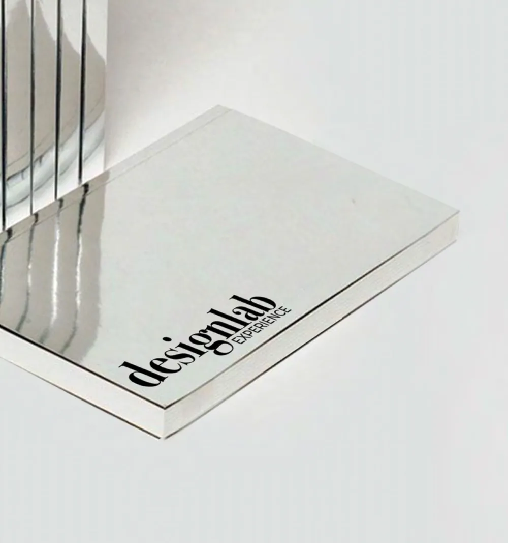
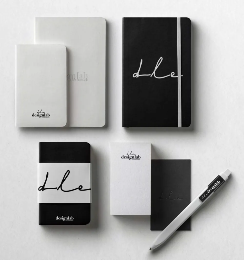
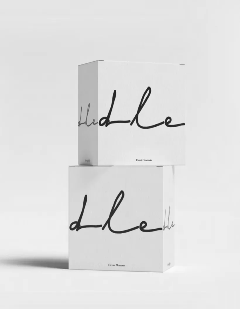
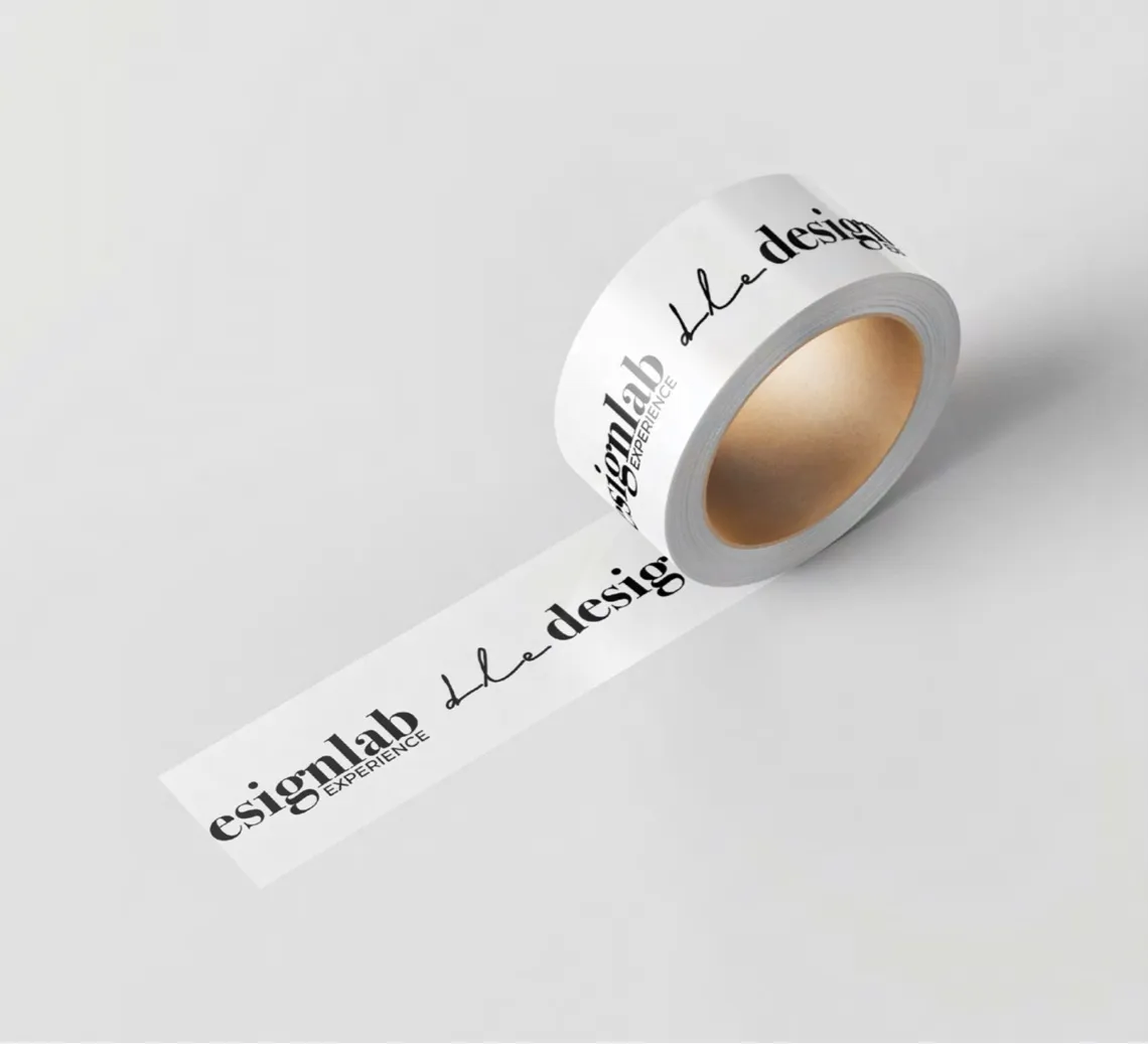
Letterhead, cards, notebooks, boxes and tape. Black and white, with dle wherever it fits.
On site
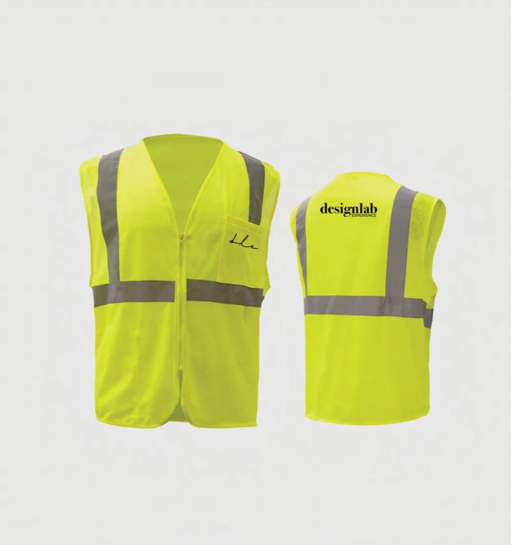
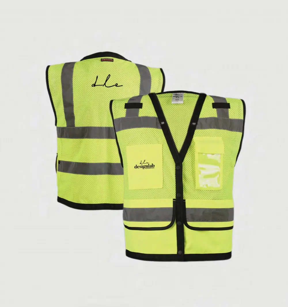
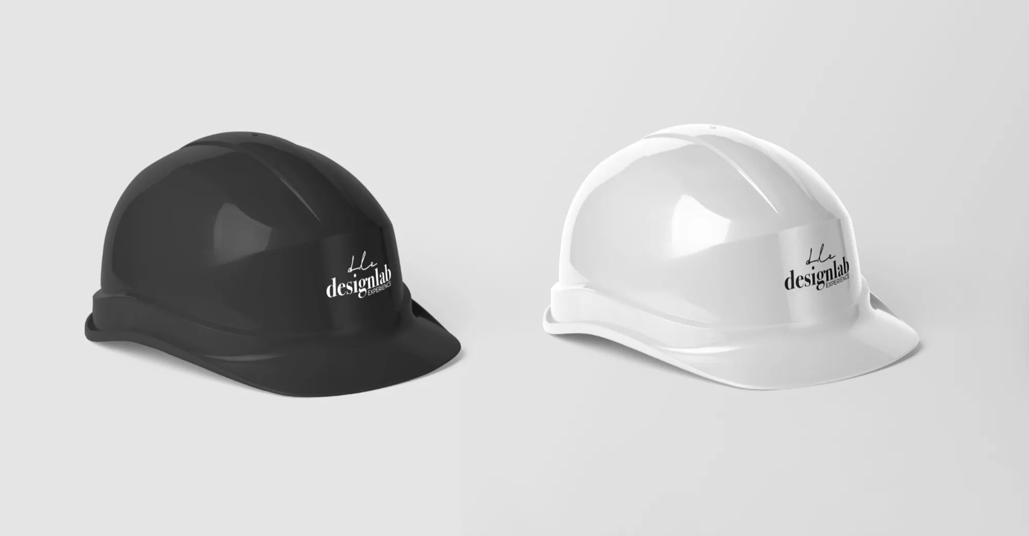
For a studio that builds what it designs: safety vests and hard hats.
It was a joy to work with them. What a talented team.